
Midwest Regal Firm.
A website that explains doorstep trash collection and helps apartment property managers request a quote.
Business website
Design & front-end development
HTML / CSS / JavaScript / Formspree
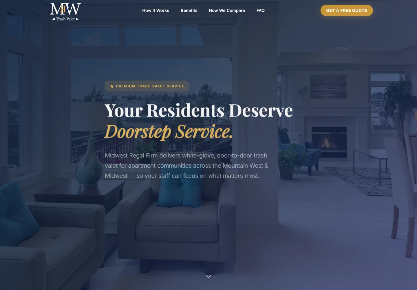
What I set out to build.
Midwest Regal Firm needed a website for its doorstep trash-valet service. I brought the service steps, benefits, common questions, and quote request together on one page so property managers could get the information they needed.
The goals
- Explain the service before asking visitors to get in touch.
- Keep the quote request easy to find throughout the page.
- Give the business a consistent identity across desktop and mobile.
Responsibilities
- Page structure and visual direction
- Responsive HTML, CSS, and JavaScript
- Comparison slider, FAQ, and quote-form interface
The challenge
A property manager should be able to understand the service quickly. I needed to explain how collection works and make the quote form easy to find without repeating a sales pitch in every section.
Who it’s for
Apartment property managers and multifamily teams looking into a doorstep collection service for their residents.
Visual direction
Navy, gold, and a serif headline give the business a consistent look. I used apartment imagery to show where the service fits, then broke up the longer page with clear headings and smaller sections.
Using the site
Visitors can move through the service steps, drag a before-and-after comparison, open FAQ answers, and jump straight to the quote form. The mobile menu closes after choosing a section so it stays out of the way of the page.
Technical approach
The site uses plain HTML, CSS, and JavaScript with no application build step. JavaScript handles the small interactive pieces; the quote form posts to Formspree and has inline success and error feedback.
Responsive behavior
The wide navigation becomes a mobile menu, content grids stack, and the comparison table can scroll horizontally. The image comparison supports both mouse and touch input.
Accessibility
The comparison slider supports arrow keys and exposes its current value. FAQ buttons announce whether they are expanded, and Escape closes the mobile menu and returns focus to its trigger.
Performance
A static page keeps the deployment straightforward and avoids an application runtime. Scroll work is scheduled with requestAnimationFrame, and the hero parallax is disabled on small screens and for reduced motion.
What I had to work through
I organized the page around three questions: what is included, how does it work, and how do I get a quote? That helped me decide what to keep near the top and what could sit further down.
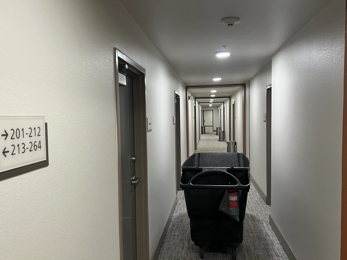
Outcome
The website is live at midwestregalfirm.com. Visitors can read about the service, compare options, check the FAQ, and send a quote request.
What I learned
Writing down the questions a visitor might ask made the layout easier to plan. The page improved when I focused on answering them in a useful order.
What’s next
Test the complete inquiry flow on more phones, reduce image weight, and add FAQ answers as the business hears new questions.